When adding a modal to a page, be sure to place it outside of #siteContent. The page content will be locked when the modal is active.
Accessiblity Tip:
Modal behaviors: When a modal is active, the newly opened dialogue should receive the focus and the remainder of the page should be deactived and hidden from access from screen readers. Only the controls within the modal should be accessible at this point until that dialog box has been closed.
Essential Guides for Modals/Dialog
For the sake of brevity, we will refer to Modals, Dialogs and Pop-ups collectively as Modals.
Models are great because they are highly effective at grasping the reader's attention, and they can easily accommodate simple or complex html code. However, exercise caution not to overuse modals because they are interruptive by nature, diverting the user’s focus from the task at hand to the newly opened dialog.
Generally, we should use modals for displaying pertinent information or for requiring user input. For instance, if a user wants to delete a record, the modal should prompt a user to confirm or cancel deletion.
Delete your account?
By deleting your account, all of your information will be permanently removed. This action cannot be undone.
Modal Content
When considering the contents of the modal, always keep the acronym, K.i.s.s. in mind, Keep It Short and Simple. Use concise questions or statements with supporting explanatory text in the content area. You can try statements like, “Delete your account?, by deleting your account all of your information will be permanently removed. This action cannot be undone.” Also, try to limit buttons to two; avoid adding links that will navigate away from the dialog.
In addition to keeping the modal content to a minimum, avoid adding multiple steps in a modal. If you find that the model content is becoming complex or large in size, it’s best to include that content in the page or create a separate page for it.
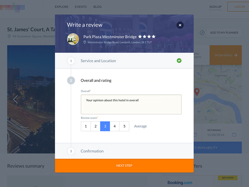
Dribble concept for Writing a review
Select Proper Dialog Type (Strict Modal V.S. Typical Modal)
Lastly, depending on the severity, you may decide to use a Typical Modal, one which allow users to click outside of them to close or a Static Modal, which can only be closed using the close buttons provided within the modal. In most cases, we will use the typical modal approach, however, it is recommended to use Static Modals when prompting the user before a critical action, for instance our record deletion example.
To make any modal “static”, simply add data-backdrop="static" on the tag containing the class="modal”.
Click on the demo modals below, once you've found your desired solution, copy the code and paste it into your web page.
Modals with buttons
<!-- Button trigger modal -->
<button type="button" class="btn btn-primary btn-lg" data-toggle="modal" data-target="#myModal">
Launch demo modal
</button>
<!-- Modals with buttons -->
<div id="myModal" class="modal fade" tabindex="-1" role="dialog" aria-labelledby="{Give same name as modal-title}" aria-hidden="false">
<div class="modal-dialog" role="document">
<div class="modal-content">
<div class="modal-header">
<button type="button" class="close" data-dismiss="modal" aria-label="Close"><span aria-hidden="true">×</span></button>
<h4 class="modal-title" id="{Give same name as modal-title}">Modal Header 4</h4>
</div>
<div class="modal-body">
<h4>Text in a modal</h4>
<p>Duis mollis, est non commodo luctus, nisi erat porttitor ligula.</p>
<hr>
<h4>Overflowing text to show scroll behavior</h4>
<p>Cras mattis consectetur purus sit amet fermentum. Cras justo odio, dapibus ac facilisis in, egestas eget quam. Morbi leo risus, porta ac consectetur ac, vestibulum at eros.</p>
<p>Praesent commodo cursus magna, vel scelerisque nisl consectetur et. Vivamus sagittis lacus vel augue laoreet rutrum faucibus dolor auctor.</p>
<p>Aenean lacinia bibendum nulla sed consectetur. Praesent commodo cursus magna, vel scelerisque nisl consectetur et. Donec sed odio dui. Donec ullamcorper nulla non metus auctor fringilla.</p>
</div>
<div class="modal-footer">
<button type="button" class="btn btn-default closedata" data-dismiss="modal">Close</button>
<button type="button" class="btn btn-primary">Save changes</button>
</div>
</div>
<!-- /.modal-content -->
</div>
<!-- /.modal-dialog -->
</div>
<!-- /.modal -->
Using modals in lists
The following is an example of an order/unordered lists that uses modals.
<!-- Link trigger modal in list -->
<ul class="list-unstyled list-border">
<li>
<span class="glyphicon glyphicon-circle-arrow-right">
</span> <a href="#" data-toggle="modal" data-target="#NameOfModal">Audio Visual Equipment and Supplies</a>
</li>
</ul>
<!-- Modal in list -->
<div id="NameOfModal" class="modal fade" tabindex="-1" role="dialog" aria-labelledby="{Give same name as modal-title}" aria-hidden="false">
<div class="modal-dialog" role="document">
<div class="modal-content">
<div class="modal-header">
<button type="button" class="close" data-dismiss="modal" aria-label="Close"><span aria-hidden="true">×</span></button>
<h3 class="modal-title" id="{Give same name as modal-title}">Modal Header 3</h3>
</div>
<div class="modal-body">
<h4>Text in a modal</h4>
<p>Duis mollis, est non commodo luctus, nisi erat porttitor ligula.</p>
<hr>
<h4>Overflowing text to show scroll behavior</h4>
<p>Cras mattis consectetur purus sit amet fermentum. Cras justo odio, dapibus ac facilisis in, egestas eget quam. Morbi leo risus, porta ac consectetur ac, vestibulum at eros.</p>
<p>Praesent commodo cursus magna, vel scelerisque nisl consectetur et. Vivamus sagittis lacus vel augue laoreet rutrum faucibus dolor auctor.</p>
<p>Aenean lacinia bibendum nulla sed consectetur. Praesent commodo cursus magna, vel scelerisque nisl consectetur et. Donec sed odio dui. Donec ullamcorper nulla non metus auctor fringilla.</p>
</div>
<div class="modal-footer">
<button type="button" class="btn btn-default closedata" data-dismiss="modal">Close</button>
</div>
</div>
<!-- /.modal-content -->
</div>
<!-- /.modal-dialog -->
</div>
<!-- /.modal -->
Modal Header 4
Text in a modal
Duis mollis, est non commodo luctus, nisi erat porttitor ligula.
Overflowing text to show scroll behavior
Cras mattis consectetur purus sit amet fermentum. Cras justo odio, dapibus ac facilisis in, egestas eget quam. Morbi leo risus, porta ac consectetur ac, vestibulum at eros.
Praesent commodo cursus magna, vel scelerisque nisl consectetur et. Vivamus sagittis lacus vel augue laoreet rutrum faucibus dolor auctor.
Aenean lacinia bibendum nulla sed consectetur. Praesent commodo cursus magna, vel scelerisque nisl consectetur et. Donec sed odio dui. Donec ullamcorper nulla non metus auctor fringilla.
Modal Header 3
Text in a modal
Duis mollis, est non commodo luctus, nisi erat porttitor ligula.
Overflowing text to show scroll behavior
Cras mattis consectetur purus sit amet fermentum. Cras justo odio, dapibus ac facilisis in, egestas eget quam. Morbi leo risus, porta ac consectetur ac, vestibulum at eros.
Praesent commodo cursus magna, vel scelerisque nisl consectetur et. Vivamus sagittis lacus vel augue laoreet rutrum faucibus dolor auctor.
Aenean lacinia bibendum nulla sed consectetur. Praesent commodo cursus magna, vel scelerisque nisl consectetur et. Donec sed odio dui. Donec ullamcorper nulla non metus auctor fringilla.